Wednesday 24 November 2010

Portrait Photography Relating to Bands

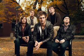
This is a photo that we could draw inspiration from for our project. I like the positioning of the people in the shot and how the background works with the shot. The colour and the balance of the shot looks really good too.

This is obviously done in the studio. It works well because the people are well positioned. The simple background offsets the band and all the colours in their clothing. With the studio in college this is something we could do.

A more complicated version and heavily photoshoped but an effective shot. It is the opposite end of what we could achieve in college.  From this we could look at positioning of the people in the shot and maybe look at using some form of props.

A different photo relating to bands. I like how it does not feature the face of the person playing instead focussing on the instrument that makes the sounds that we like. I like the original detailing in the guitar, and the contrast with the dark background. This is achievable in the studio or on location.

I like this shot because there is a lot going on. I like how the frontman is in focus and in colour. I think its good how instead of them looking posed there is something going on with the group in the background providing more of a snapshot of a moment and a slight narrative to the shot. It juxtaposes both the use of photoshop and the creative aspect of capturing the moment.


A studio portrait from the early days of Pink Floyd. Again an effective so because of the positioning of the band and the use of the frame. I like how none of them are looking at the camera. It also really works in black and white.

A location photo of Pink Floyd from later on in the bands history. I like how only two of them are looking at the camera and the others are not. It makes the viewers wonder what is going on outside of the frame. It doesn't however look like they are posing for the photo.


A black and white portrait of Syd Barratt. I like how the image is under-exposed. This could be achieved in the studio with the individual work with the band that we have to do a promotion project for.

I have chosen to look at portrait photography relating to bands as it ties in with the work that we are doing on band promotion. Portrait Photography on its own was too generic and therefore had images un-relating in both style and subject to the project that we are doing.
Wednesday 10 November 2010

Location Shoot Research

These are some examples of places and techniques that we could use to shoot the album cover.

Nature Shots featured quite heavily in some of the images that we looked at, not necessarily with the artists in them but some of them just had the title on them. i like the spiderweb effect of the branches and the light streaming through the leaves. The lines although not leading in create a lot of texture in the image. There is also a lot of texture in the bark. This image would look good in black and white or greyscale.


Although not very usable in the actual shoot as it is a memorial, landmarks did feature in some of the locations used in original band shoots. We could use this as an idea and produce a whole series of landmarks in graphics and then photograph the band in the studio. The band could then be pasted onto the graphic background.


Wide shots of landscapes were popular in the research. Like this one they had lots of contrasting lines that lead in and out. In this photo there is plenty of options as to where the band could be placed. it would look better with the three bushes in the foreground so that then it follows the rule of photographing things in threes. The photo also follows the rule of thirds in that the bushes are in the foreground, the paths leading in and out, of which there is three, is in the mid-ground, and the war memorial is in the background.


I liked the stairwell shots that were found in the research. although with the research shots there were wide stairwells with not a lot of harsh colouring or lighting. The stairwells were wider but i still like the depth achieved with this shot.


Some of the research included pictures that were taken by the river. I think although this may be a little difficult for the actual location shoot we could still use the area. I like the texture of the shots because of the autumn leaves. The rule of thirds has been obeyed to a certain extent as there is another bush in the mid ground, although there is a lot of colour in this picture as it is autumn I don't think it would work in black and white.


A plain shot of some leaves but it works. There is a lot of texture and colour which could work in black and white. There is no rule of thirds involved but I think thats what makes it work. This would look good if it were lots of different leaves in the Autumn colours arranged over a nice background, this would make it more of a studio shot than a nature shot but it makes it more effective.

Overall I like these shots, the ones done outside on location would really work well with the band, I like the idea of the landmarks done in graphics for which we would need the photos of them, we could still do studio shots of the band and impose them onto the graphic background. This would incorporate aspects of both studio work with the band and graphics. We could still be playing with perspective and rule of thirds when we photograph the band and with the overall piece. 

Tuesday 9 November 2010

Band Identity Photograph Research


This is a good example of a studio photo. The plain white background makes this shot almost applicable anywhere. The photo uses the rule of thirds for a portrait and has left enough white space above the heads. Colour and tonal range in this image go from one end of the spectrum to the other. There is a stark white background and a lot of black in what the subjects are wearing. This is something like what we could do with our own studio set up.


Although not a studio photo this is something like this could be achieved with our own band. I like how the subject is off centre but the rue of thirds still applies. The colours give a great amount of contrast and are offset perfectly by the subject who is wearing black. The lines in this photo not only lead in and lead out but they also help to add a lot of texture to the image, as do the clouds. The perspective adds to the overall feel of the image. The viewer feels very small.


This is a good combination of using a detailed, textured image and black and white portraiture. Although a black and white photo there is enough tonal range here to still give it the full effect. it is well framed and the rule of thirds has still been obeyed with the guitar in the foreground. There is a lot of texture in this image from the floor boards through to the guitar and what the subject is wearing, by turning the image black and white it brings these otherwise contrasting things out to its advantage. Although a face on perspective it is very relaxed.


This uses the rule of thirds differently in that there are three people in the picture. it has mainly dark colours but this works in its advantage. There is texture used quite heavily in the background in the building they are stood in front of. The perspective adds a lot of height and depth to the image. It's a casual photograph that works as well as something that is done in the studio, the same effect has been achieved.

Images from: Paul Harries, Andy Wilsher, Kevin Estrada.