Wednesday, 15 December 2010

Location and Design


With this image i wanted to look at the lines from a design point of view. I Think that maybe we could use pattern and colour in the band promotion and identity project. this i intend to use as a base for a colour design with some of the band graphics on it.

I like the effect of the stamped concrete and think that this is an effect that could be achieved on illustrator.  Although the text is something that I think will need to be change to fit the product.

One of the scenes above without the frost and snow. I am not sure that this will work as a location as this is basically one of the barriers by the river.
Another idea from pattern and design that I think could work, either as stripes or different materials in pattern and texture. If something like that could be changed to greyscale and then a band logo added this could help make an effective album cover.

I like the angle that I took this image and the overall effect of the lines. I think it looks more like a stock image or a photo from the college brochure than the ideal photo for a rock promotion shoot.

With this image I think that lines in the bricks lead to the hand rail and the contrasting lines of the stairs. If this shot could be made wider I think that this would make a good location shoot for the album cover. I like the tone of the bricks on the wall. i think that the wall space could be used with a grafitti style band logo on it.

From a design perspective Lines could be really important in the overall product not just from a photography point of view, there is contrast here but I want to accentuate the colours from a design point of view. An ideal starting image for a design project.

I think that he bright colours and the use of lines really work here. I like how the bright orange really contrast with the blue and I think these could really work in the promotional projects.

I think these would make an ideal set piece for the photo shoot and I like the fact that they are a bright colour and have an interesting shape.

Long exposure with lots of camera movement, its actually from the stools above giving it a pink/purple tone. this is something I could work on with an object of stringer colours.

Wednesday, 8 December 2010

Snow Day Photos - Christmas Card Project


A frosty photo of the town centre with the tree on the right. The tree should be in the foreground and the town in the background.


The tree in this photo provides a good sense of perspective and the bushes provide good lead in lines to the church. The church spire is frames in the tree tops.


This photo contains both patterns and lines. I like the framing as it is not just a standard shot of a bench. there is good contrast in the dark outline of the iron bench and the frost that surrounds it.


This would have been a perfect shot of the church perfectly framed with the spire in the middle and the trees in the mid-ground. this would of course look much better if there was more snow or frost in the foreground, also the palettes would look better removed.


This photo is a winter perspective over the fields towards the river. I like the fact that there is three trees in the photo. The tree on the right helps provide some framing to the photo.


The trees in this photo help provide an eye line that eventually leads to the buildings in the background.
This would look better with added detail in the foreground.


A typical winter scene with the frost hanging off the vegetation. It would look better with added colour or contrast, holly for instance with berries.


I like the line of the path leading the eyes into the trees. if this was a festive greeting card design it would look better with a snowman in the foreground or a family walking down the path.


This image looks good with the blue sky in the background providing good contrast to the frosty scene below. i like how the path covers the entire fore of he shot and leads the eye to the path at the back disappearing out of the frame.


A wide shot of the memorial gardens and the town centre. i have used the three bushes to give it a sense of perspective.

Wednesday, 1 December 2010

Location Shoot 2


I like this photo because the white boxing on the wall provides great lead in lines, I think it looks good with the tables in the foreground and the mid ground. I could do something with the band in the background to improve on this shot. I think that it follows the rule of thirds, to accentuate this I would have to work more closely with the band.


Although this is only a picture of the plants by the window. I like the symetry that is in the shot. The shot also features threes. I think that this works. There is something with the band that could be done with the positioning of the group.


This photo features the main stairwell in the HE block. The steel handrail provides a good lead in line up to the top level. stairwells featured in the research but this is a more modern clean take on the ones that were used, this styling may not fit the genre or the type of music that we are promoting.


This is a good example of a wide angle weather shot in the college. I could improve on this by including more sky in the background and less in the foreground. This type of shot would look better when the weather is better as it would provide better contrast and emphasis. The angle that I chose to take the photo means that the benches lead your eye to either the building or the tree.


I love the positioning of this photo with the table leading to the glass doors and the other area. It would look better with the door thrown open so there is a clear break in the translucent panels. it would also be an improvement without the column in the left of the photo. As for positioning of people in the photo there is lots that could be done. Some could be sitting on the blue chairs in the foreground and some on the sofas in background, I would also like to add a sense of narrative style to the photo.


This almost looked perfect exactly as it was. There were some chairs just waiting to be occupied. If the band members were holding different props or instruments but the same linear arrangement was used this could work really well. Simple and uncomplicated.


Although this photo features someone else's advert I really like the sense of perspective that crouching below the line of the table adds to the photo, it makes the viewer feel really small. If i could put some graphic band advertisement or set piece in place of the advert and use the same perspective with the band  in place this could work really well. It kind of reminds me of concert photography where people are photographing the band from below the line of the stage.

Wednesday, 24 November 2010

Portrait Photography Relating to Bands

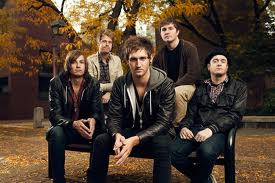
This is a photo that we could draw inspiration from for our project. I like the positioning of the people in the shot and how the background works with the shot. The colour and the balance of the shot looks really good too.

This is obviously done in the studio. It works well because the people are well positioned. The simple background offsets the band and all the colours in their clothing. With the studio in college this is something we could do.

A more complicated version and heavily photoshoped but an effective shot. It is the opposite end of what we could achieve in college.  From this we could look at positioning of the people in the shot and maybe look at using some form of props.

A different photo relating to bands. I like how it does not feature the face of the person playing instead focussing on the instrument that makes the sounds that we like. I like the original detailing in the guitar, and the contrast with the dark background. This is achievable in the studio or on location.

I like this shot because there is a lot going on. I like how the frontman is in focus and in colour. I think its good how instead of them looking posed there is something going on with the group in the background providing more of a snapshot of a moment and a slight narrative to the shot. It juxtaposes both the use of photoshop and the creative aspect of capturing the moment.


A studio portrait from the early days of Pink Floyd. Again an effective so because of the positioning of the band and the use of the frame. I like how none of them are looking at the camera. It also really works in black and white.

A location photo of Pink Floyd from later on in the bands history. I like how only two of them are looking at the camera and the others are not. It makes the viewers wonder what is going on outside of the frame. It doesn't however look like they are posing for the photo.


A black and white portrait of Syd Barratt. I like how the image is under-exposed. This could be achieved in the studio with the individual work with the band that we have to do a promotion project for.

I have chosen to look at portrait photography relating to bands as it ties in with the work that we are doing on band promotion. Portrait Photography on its own was too generic and therefore had images un-relating in both style and subject to the project that we are doing.

Wednesday, 10 November 2010

Location Shoot Research

These are some examples of places and techniques that we could use to shoot the album cover.

Nature Shots featured quite heavily in some of the images that we looked at, not necessarily with the artists in them but some of them just had the title on them. i like the spiderweb effect of the branches and the light streaming through the leaves. The lines although not leading in create a lot of texture in the image. There is also a lot of texture in the bark. This image would look good in black and white or greyscale.


Although not very usable in the actual shoot as it is a memorial, landmarks did feature in some of the locations used in original band shoots. We could use this as an idea and produce a whole series of landmarks in graphics and then photograph the band in the studio. The band could then be pasted onto the graphic background.


Wide shots of landscapes were popular in the research. Like this one they had lots of contrasting lines that lead in and out. In this photo there is plenty of options as to where the band could be placed. it would look better with the three bushes in the foreground so that then it follows the rule of photographing things in threes. The photo also follows the rule of thirds in that the bushes are in the foreground, the paths leading in and out, of which there is three, is in the mid-ground, and the war memorial is in the background.


I liked the stairwell shots that were found in the research. although with the research shots there were wide stairwells with not a lot of harsh colouring or lighting. The stairwells were wider but i still like the depth achieved with this shot.


Some of the research included pictures that were taken by the river. I think although this may be a little difficult for the actual location shoot we could still use the area. I like the texture of the shots because of the autumn leaves. The rule of thirds has been obeyed to a certain extent as there is another bush in the mid ground, although there is a lot of colour in this picture as it is autumn I don't think it would work in black and white.


A plain shot of some leaves but it works. There is a lot of texture and colour which could work in black and white. There is no rule of thirds involved but I think thats what makes it work. This would look good if it were lots of different leaves in the Autumn colours arranged over a nice background, this would make it more of a studio shot than a nature shot but it makes it more effective.

Overall I like these shots, the ones done outside on location would really work well with the band, I like the idea of the landmarks done in graphics for which we would need the photos of them, we could still do studio shots of the band and impose them onto the graphic background. This would incorporate aspects of both studio work with the band and graphics. We could still be playing with perspective and rule of thirds when we photograph the band and with the overall piece. 

Tuesday, 9 November 2010

Band Identity Photograph Research


This is a good example of a studio photo. The plain white background makes this shot almost applicable anywhere. The photo uses the rule of thirds for a portrait and has left enough white space above the heads. Colour and tonal range in this image go from one end of the spectrum to the other. There is a stark white background and a lot of black in what the subjects are wearing. This is something like what we could do with our own studio set up.


Although not a studio photo this is something like this could be achieved with our own band. I like how the subject is off centre but the rue of thirds still applies. The colours give a great amount of contrast and are offset perfectly by the subject who is wearing black. The lines in this photo not only lead in and lead out but they also help to add a lot of texture to the image, as do the clouds. The perspective adds to the overall feel of the image. The viewer feels very small.


This is a good combination of using a detailed, textured image and black and white portraiture. Although a black and white photo there is enough tonal range here to still give it the full effect. it is well framed and the rule of thirds has still been obeyed with the guitar in the foreground. There is a lot of texture in this image from the floor boards through to the guitar and what the subject is wearing, by turning the image black and white it brings these otherwise contrasting things out to its advantage. Although a face on perspective it is very relaxed.


This uses the rule of thirds differently in that there are three people in the picture. it has mainly dark colours but this works in its advantage. There is texture used quite heavily in the background in the building they are stood in front of. The perspective adds a lot of height and depth to the image. It's a casual photograph that works as well as something that is done in the studio, the same effect has been achieved.

Images from: Paul Harries, Andy Wilsher, Kevin Estrada.

Wednesday, 20 October 2010

Completed Stop Motion Video


This is the completed video based around 80's games that was done in larger group. The stop motion complies with the storyboard in the previous post. A soundtrack was added to make this look more like a music promotional video. I think that the video works according to the storyboard upon completion. The placing of the soundtrack works in time with the movement of the games across the board. The thing that I would have improved on is the exposure of the images as sometimes the background, although a good effect, does change colour slightly during the video. I like how the orange straws offset the sweets and the black card.