Wednesday, 1 December 2010
Location Shoot 2
I like this photo because the white boxing on the wall provides great lead in lines, I think it looks good with the tables in the foreground and the mid ground. I could do something with the band in the background to improve on this shot. I think that it follows the rule of thirds, to accentuate this I would have to work more closely with the band.
Although this is only a picture of the plants by the window. I like the symetry that is in the shot. The shot also features threes. I think that this works. There is something with the band that could be done with the positioning of the group.
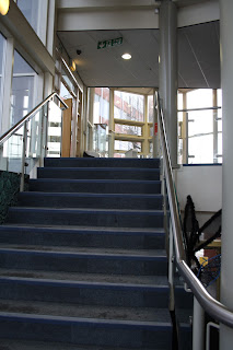
This photo features the main stairwell in the HE block. The steel handrail provides a good lead in line up to the top level. stairwells featured in the research but this is a more modern clean take on the ones that were used, this styling may not fit the genre or the type of music that we are promoting.
This is a good example of a wide angle weather shot in the college. I could improve on this by including more sky in the background and less in the foreground. This type of shot would look better when the weather is better as it would provide better contrast and emphasis. The angle that I chose to take the photo means that the benches lead your eye to either the building or the tree.
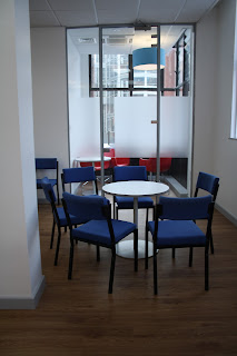
I love the positioning of this photo with the table leading to the glass doors and the other area. It would look better with the door thrown open so there is a clear break in the translucent panels. it would also be an improvement without the column in the left of the photo. As for positioning of people in the photo there is lots that could be done. Some could be sitting on the blue chairs in the foreground and some on the sofas in background, I would also like to add a sense of narrative style to the photo.
This almost looked perfect exactly as it was. There were some chairs just waiting to be occupied. If the band members were holding different props or instruments but the same linear arrangement was used this could work really well. Simple and uncomplicated.
Although this photo features someone else's advert I really like the sense of perspective that crouching below the line of the table adds to the photo, it makes the viewer feel really small. If i could put some graphic band advertisement or set piece in place of the advert and use the same perspective with the band in place this could work really well. It kind of reminds me of concert photography where people are photographing the band from below the line of the stage.
Subscribe to:
Post Comments (Atom)


No comments:
Post a Comment