Wednesday, 26 January 2011

CD Box and Graphics

For this project I have been asked to design an album cover and a CD box. The brief was to be as original as possible with the CD box and use s much graphics as possible with the album cover. The CD case can contain a lyric book or be a single box or sleeve.
I really like this as an idea for a CD cover. its almost combining the DVD case and the CD sleeve. There is plenty of places with which I could put the graphics. The packaging is still functional as it can still contain the booklet. In terms of construction this is the simplest of the packaging that I have considered.

This one I could chose to adapt, so instead of a piece of card with three folds there will be four making either a dual CD Cover or a CD cover and a booklet holder. with this design there will be four surfaces that I will be able to put graphics on.
Although this is really corporate and more for software packages I still like the idea that the box has a very definate lid. This is more complex and has lots of compartments as part of its solid net construction. the idea that I had from mine was to build items out of separate nets and put them into boxes.
This is similar to how I would like the finished product. Although this has a separate plastic CD case, I am going to design a similar box. The CD will fit into a removable base made from a separate net. It limits the surface to put graphics but it will create more of a luxury packaging that is neither too corporate  nor too fussy, people will be buying the album for the music not the packaging.
This is a starting point image for the graphics and images on the case. I like how the moon is orange and reflects the nature of the title of the album cover. Colour was something that I intended to use and balance in the final album cover.
This is something I would like to create in Photoshop with a normal photograph of a moon. I don't know whether I want the moon to be blue. I like the reflective quality of the moon as it suggests another side to it but I don't know whether I want it reflected in water. I quite like the idea of duplicating the moon, making it out of focus and then changing the colour.
This is a NASA photograph of the moon and although I like the idea of it being coloured I think that the multicoloured effect although tying in with the light prism does not look good on the moon itself. I combines the two design ideas but not as effectively.
A separate idea from the moon I like the ideas of having almost a caged light. It still ties in with the album cover but it takes a different approach. if I could superimpose a luminescent moon onto a jar in the dark it would make an effective album cover also relating to the music.
Although this is a science picture it relates to the original album cover. I could still use the light spectrum in the mage but as a divider between the two moons. It still suggests a dark side and also incorporates elements of the original album cover. I could also use the spectrum as a rippled light effect behind the moon or around the moon, it is after all light.
Here is another cover from the same album that differs from the original. I like the moon behind the triangle and the birds flying in on the light beam, the blurred light spectrum and hazes created by other light beams works. I think that having almost different layers and incorporating elements from song themes is something that I would like to do with my album cover.

Wednesday, 19 January 2011

Band Poster/Album Cover


This is another band poster/album cover that I created using Illustrator, I started by finding more free fonts online. I found some vector images of people silhouettes online and once I imported them into Illustrator I used the live trace tool to separate the people as they were originally two images. Using the new texts I gave it a title and a name, these were done with the same method that I used to create the first album cover. The last three words, the title, also fit with the way that I have arranged the people in the picture and the title text. I found a picture of the Eiffel Tower and changed the contrast so that it was the same contrast scale as the people. It gives a sense of narrative or what might be in the album.

Band Event Poster


These are the photos that I have used to make the flyer. I have used the war memorial photo and changed the effect so that it looks like a pencil drawing. It was only a rough tracing but I think that it looks effective. The wall I used as a background for the whole piece, I could have created the circles in Illustrator. The butterfly was some student artwork hanging in the foyer.

I added in the text and the help for heroes logos to give the poster some context.

Wednesday, 5 January 2011

Album Cover Research - Pink Floyd


Most of Pink Floyd's Album covers were designed by English Graphic designer Storm Thorgerson. They mainly use iconic imagery that combines graphics with Photography and often correlate to the songs on the album rather than using portraits, these were often included in the sleeve. 

This is the album cover for Pulse, the ideas behind this related to light and the pulse. ideas from other albums were used but the eye came second. I like the fact that the eye was used as so many of the Floyd's songs are about perception. the design also reflected elements of the live show
This is the album cover for the Wall. It is a compilation of all of the other album covers with an early band photo in the centre.
Dark Side of the Moon also uses light and physics as part of the design. Light is continuous and the pulse on the inside of the cover relates to the heat beat and the music. I like the black background as it makes so much more of the light idea and colour work really well.
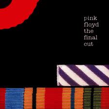
I like the texture on the album cover for the final cut. I think it gives a different perspective from all of the other Pink Floyd Album covers. the texture is almost a covering in itself as most of their album covers expose some meaning in imagery.
I like the album cover for wish you were here and the nod to Syd Barratt. The Burning man is kind of poignant. The album design was to represent absense. the Burning of Bridges. The photo could also beinterpreted in another way, a satire to fame. The background is the movie studios in hollywood.
The beds was said to reflect the circumstances of the band at the time. It seemed that the band would break up and Pink floyd would no longer be. the endless stream of beds came from one of the songs on the album. I like how the imagery relates to both the songs and the band.
I like the album cover from Us and Them and the predatory nature of the creature in the image.
a more direct reference to the past both in songs and the band playing. it was an album about communication. the idea behind the cover was to disconnect and disrupt the image. two faces become a third.
I like how the disruption of the water relates to the albums title and how the shape in the water is distorted.
i like the distorted imagery and montage like effect of this album cover. there is bottles, star charts, space scenes. it represents a lot of what Pink Floyd music is about and some of the themes in the songs. this makes a better album cover than portraiture. i like how the text is split up the only clear part being Pink Floyd.
The idea behind this album cover was to create multilayers and many dimensions. There is a lot of depth to the image. i like how there is a sense of narrative going on within the image.
The other covers  for wish you were here. and one of the songs in the album. I like the distorted heads and fishbowls, a direct reference to one of the songs and of course Syd. I like the colours and contrasts used in welcome to the machine.
Echoes like the title suggests is a reference to all things past. I like how there are many windows with many references within to some of the Floyds previous album covers.
Finally an example of a CD that has both graphics and photography and some pop art. one of the few cds to contain portraiture.

Reasons and interpretations of the album cover designs from: MIND OVER MATTER 4 THE IMAGES OF PINK FLOYD STORM THORGERSON AND PETER CURZON.


The reason that I wanted to include the designers reasoning and interpretation of the album covers in the research is that it is helpful to know what to look for and how to use an artists music in the creation of the covers. I wanted this research project to be different, it is ok to say why I like a cover but I wanted to know why the designer chose it or liked it.