Most of Pink Floyd's Album covers were designed by English Graphic designer Storm Thorgerson. They mainly use iconic imagery that combines graphics with Photography and often correlate to the songs on the album rather than using portraits, these were often included in the sleeve.
This is the album cover for Pulse, the ideas behind this related to light and the pulse. ideas from other albums were used but the eye came second. I like the fact that the eye was used as so many of the Floyd's songs are about perception. the design also reflected elements of the live show
This is the album cover for the Wall. It is a compilation of all of the other album covers with an early band photo in the centre.
Dark Side of the Moon also uses light and physics as part of the design. Light is continuous and the pulse on the inside of the cover relates to the heat beat and the music. I like the black background as it makes so much more of the light idea and colour work really well.
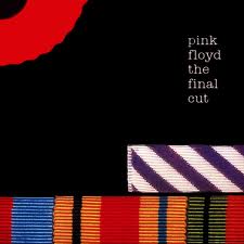
I like the texture on the album cover for the final cut. I think it gives a different perspective from all of the other Pink Floyd Album covers. the texture is almost a covering in itself as most of their album covers expose some meaning in imagery.
I like the album cover for wish you were here and the nod to Syd Barratt. The Burning man is kind of poignant. The album design was to represent absense. the Burning of Bridges. The photo could also beinterpreted in another way, a satire to fame. The background is the movie studios in hollywood.
The beds was said to reflect the circumstances of the band at the time. It seemed that the band would break up and Pink floyd would no longer be. the endless stream of beds came from one of the songs on the album. I like how the imagery relates to both the songs and the band.
I like the album cover from Us and Them and the predatory nature of the creature in the image.
a more direct reference to the past both in songs and the band playing. it was an album about communication. the idea behind the cover was to disconnect and disrupt the image. two faces become a third.
I like how the disruption of the water relates to the albums title and how the shape in the water is distorted.
i like the distorted imagery and montage like effect of this album cover. there is bottles, star charts, space scenes. it represents a lot of what Pink Floyd music is about and some of the themes in the songs. this makes a better album cover than portraiture. i like how the text is split up the only clear part being Pink Floyd.
The idea behind this album cover was to create multilayers and many dimensions. There is a lot of depth to the image. i like how there is a sense of narrative going on within the image.
The other covers for wish you were here. and one of the songs in the album. I like the distorted heads and fishbowls, a direct reference to one of the songs and of course Syd. I like the colours and contrasts used in welcome to the machine.
Echoes like the title suggests is a reference to all things past. I like how there are many windows with many references within to some of the Floyds previous album covers.
Finally an example of a CD that has both graphics and photography and some pop art. one of the few cds to contain portraiture.
Reasons and interpretations of the album cover designs from: MIND OVER MATTER 4 THE IMAGES OF PINK FLOYD STORM THORGERSON AND PETER CURZON.
The reason that I wanted to include the designers reasoning and interpretation of the album covers in the research is that it is helpful to know what to look for and how to use an artists music in the creation of the covers. I wanted this research project to be different, it is ok to say why I like a cover but I wanted to know why the designer chose it or liked it.


No comments:
Post a Comment