Wednesday, 16 February 2011
Album cover design
This is a mock up of how I would like my album cover to look. these are not my images. i did the design and layout in illustrator but had to convert to photoshop to upload onto blogger hence the clear outlines of the pictures and the layering.
I like how how the reflected moon is orange and slightly blurred out. The orange colour of the moon and the tree outline also give a sense of perspective, this is not two moons there is another side to the moon. i was going to have the triangle and he colour incorporated over he moons but i think that it works better when placed at the bottom with the title in between.
the text used in the title works really well and shows clearly against the black background, the text is a clearly legible copperplate font. overall when the whole thing is blended together and the outlines are removed I think it will be quite effective.
Monday, 14 February 2011
CD Design box
i would like the CD design to be a mixture of photographic elements and the graphic design ones. i think that i should keep the background black as per the original design. this also ties in with the original cover of the album. i think that by using two images of the moon and blurring and changing the colour balance of the second it will create almost a kind of mirror effect. the change in colour can also be implemented to the albums title. incorporating some of the famous designs original features i intend to use the prism and the light spectrum but maybe use the moon itself for the design. i think that in having a box with a pul out cd tray as opposed to a fixed one will be an advantage. the accompanying booklet can be put on the inside of the lid.
Wednesday, 26 January 2011
CD Box and Graphics
For this project I have been asked to design an album cover and a CD box. The brief was to be as original as possible with the CD box and use s much graphics as possible with the album cover. The CD case can contain a lyric book or be a single box or sleeve.
I really like this as an idea for a CD cover. its almost combining the DVD case and the CD sleeve. There is plenty of places with which I could put the graphics. The packaging is still functional as it can still contain the booklet. In terms of construction this is the simplest of the packaging that I have considered.This one I could chose to adapt, so instead of a piece of card with three folds there will be four making either a dual CD Cover or a CD cover and a booklet holder. with this design there will be four surfaces that I will be able to put graphics on.
Although this is really corporate and more for software packages I still like the idea that the box has a very definate lid. This is more complex and has lots of compartments as part of its solid net construction. the idea that I had from mine was to build items out of separate nets and put them into boxes.
This is similar to how I would like the finished product. Although this has a separate plastic CD case, I am going to design a similar box. The CD will fit into a removable base made from a separate net. It limits the surface to put graphics but it will create more of a luxury packaging that is neither too corporate nor too fussy, people will be buying the album for the music not the packaging.
This is a starting point image for the graphics and images on the case. I like how the moon is orange and reflects the nature of the title of the album cover. Colour was something that I intended to use and balance in the final album cover.
This is something I would like to create in Photoshop with a normal photograph of a moon. I don't know whether I want the moon to be blue. I like the reflective quality of the moon as it suggests another side to it but I don't know whether I want it reflected in water. I quite like the idea of duplicating the moon, making it out of focus and then changing the colour.
This is a NASA photograph of the moon and although I like the idea of it being coloured I think that the multicoloured effect although tying in with the light prism does not look good on the moon itself. I combines the two design ideas but not as effectively.
A separate idea from the moon I like the ideas of having almost a caged light. It still ties in with the album cover but it takes a different approach. if I could superimpose a luminescent moon onto a jar in the dark it would make an effective album cover also relating to the music.
Although this is a science picture it relates to the original album cover. I could still use the light spectrum in the mage but as a divider between the two moons. It still suggests a dark side and also incorporates elements of the original album cover. I could also use the spectrum as a rippled light effect behind the moon or around the moon, it is after all light.
Here is another cover from the same album that differs from the original. I like the moon behind the triangle and the birds flying in on the light beam, the blurred light spectrum and hazes created by other light beams works. I think that having almost different layers and incorporating elements from song themes is something that I would like to do with my album cover.
Wednesday, 19 January 2011
Band Poster/Album Cover
This is another band poster/album cover that I created using Illustrator, I started by finding more free fonts online. I found some vector images of people silhouettes online and once I imported them into Illustrator I used the live trace tool to separate the people as they were originally two images. Using the new texts I gave it a title and a name, these were done with the same method that I used to create the first album cover. The last three words, the title, also fit with the way that I have arranged the people in the picture and the title text. I found a picture of the Eiffel Tower and changed the contrast so that it was the same contrast scale as the people. It gives a sense of narrative or what might be in the album.
Band Event Poster
These are the photos that I have used to make the flyer. I have used the war memorial photo and changed the effect so that it looks like a pencil drawing. It was only a rough tracing but I think that it looks effective. The wall I used as a background for the whole piece, I could have created the circles in Illustrator. The butterfly was some student artwork hanging in the foyer.
Wednesday, 5 January 2011
Album Cover Research - Pink Floyd
Most of Pink Floyd's Album covers were designed by English Graphic designer Storm Thorgerson. They mainly use iconic imagery that combines graphics with Photography and often correlate to the songs on the album rather than using portraits, these were often included in the sleeve.
This is the album cover for the Wall. It is a compilation of all of the other album covers with an early band photo in the centre.
Dark Side of the Moon also uses light and physics as part of the design. Light is continuous and the pulse on the inside of the cover relates to the heat beat and the music. I like the black background as it makes so much more of the light idea and colour work really well.
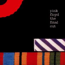
I like the texture on the album cover for the final cut. I think it gives a different perspective from all of the other Pink Floyd Album covers. the texture is almost a covering in itself as most of their album covers expose some meaning in imagery.
I like the album cover for wish you were here and the nod to Syd Barratt. The Burning man is kind of poignant. The album design was to represent absense. the Burning of Bridges. The photo could also beinterpreted in another way, a satire to fame. The background is the movie studios in hollywood.
The beds was said to reflect the circumstances of the band at the time. It seemed that the band would break up and Pink floyd would no longer be. the endless stream of beds came from one of the songs on the album. I like how the imagery relates to both the songs and the band.
I like the album cover from Us and Them and the predatory nature of the creature in the image.
a more direct reference to the past both in songs and the band playing. it was an album about communication. the idea behind the cover was to disconnect and disrupt the image. two faces become a third.
I like how the disruption of the water relates to the albums title and how the shape in the water is distorted.
i like the distorted imagery and montage like effect of this album cover. there is bottles, star charts, space scenes. it represents a lot of what Pink Floyd music is about and some of the themes in the songs. this makes a better album cover than portraiture. i like how the text is split up the only clear part being Pink Floyd.
The idea behind this album cover was to create multilayers and many dimensions. There is a lot of depth to the image. i like how there is a sense of narrative going on within the image.
The other covers for wish you were here. and one of the songs in the album. I like the distorted heads and fishbowls, a direct reference to one of the songs and of course Syd. I like the colours and contrasts used in welcome to the machine.
Echoes like the title suggests is a reference to all things past. I like how there are many windows with many references within to some of the Floyds previous album covers.
Finally an example of a CD that has both graphics and photography and some pop art. one of the few cds to contain portraiture.
Reasons and interpretations of the album cover designs from: MIND OVER MATTER 4 THE IMAGES OF PINK FLOYD STORM THORGERSON AND PETER CURZON.
The reason that I wanted to include the designers reasoning and interpretation of the album covers in the research is that it is helpful to know what to look for and how to use an artists music in the creation of the covers. I wanted this research project to be different, it is ok to say why I like a cover but I wanted to know why the designer chose it or liked it.
Wednesday, 15 December 2010
Refection and Evaluation
For some of the projects we have used the studio and will continue to use it for further projects and final project that is to do with band Identity and promotion. Since the technical run through I feel that I understand the use and function of some of the equipment in there better.
For some of the filming we have used the basic flip video cameras. they are relatively easy to use but function well when we need to do some in camera editing and consider the shots that we are using carefully. they allow for basic editing and settings but they also have the added function of having a USB connectivity.
For putting the stop motion video together we used the imovie software, it allowed us to trim the clips down and remove the zoom function that would otherwise appear on the clips. We added in a soundtrack by selecting all of the clips and dropping in the sound. It did allow for some colour editing by hue/saturation functions.
The blogger website has been beneficial for displaying the work that we have been doing. I will also be adding some of my graphics work to the site in order to further its usefulness when showing to a potential employer. I like how I can add more to the posts and therefore edit at a later date.
We have also been using a HD video camera from the media department. This with a tripod will also be useful when making our music video. this will allow for a far more professional finish to the project than using the Flip Cameras. It allows for in camera editing and use of a gunzoom microphone for the accurate recording of sound.
I like the assignment and have enjoyed the stop motion video aspect of it and have since found that if you are employed as a graphic designer you may be asked to do a similar project involving collaboration.
I think that we need more collaboration with the music department rather than just going into Burton to take pictures. We need to practice photographing people performing and playing instruments in order to make this successful at the end of the year.
For some of the filming we have used the basic flip video cameras. they are relatively easy to use but function well when we need to do some in camera editing and consider the shots that we are using carefully. they allow for basic editing and settings but they also have the added function of having a USB connectivity.
For putting the stop motion video together we used the imovie software, it allowed us to trim the clips down and remove the zoom function that would otherwise appear on the clips. We added in a soundtrack by selecting all of the clips and dropping in the sound. It did allow for some colour editing by hue/saturation functions.
The blogger website has been beneficial for displaying the work that we have been doing. I will also be adding some of my graphics work to the site in order to further its usefulness when showing to a potential employer. I like how I can add more to the posts and therefore edit at a later date.
We have also been using a HD video camera from the media department. This with a tripod will also be useful when making our music video. this will allow for a far more professional finish to the project than using the Flip Cameras. It allows for in camera editing and use of a gunzoom microphone for the accurate recording of sound.
I like the assignment and have enjoyed the stop motion video aspect of it and have since found that if you are employed as a graphic designer you may be asked to do a similar project involving collaboration.
I think that we need more collaboration with the music department rather than just going into Burton to take pictures. We need to practice photographing people performing and playing instruments in order to make this successful at the end of the year.
Location and Design
With this image i wanted to look at the lines from a design point of view. I Think that maybe we could use pattern and colour in the band promotion and identity project. this i intend to use as a base for a colour design with some of the band graphics on it.
I like the effect of the stamped concrete and think that this is an effect that could be achieved on illustrator. Although the text is something that I think will need to be change to fit the product.
One of the scenes above without the frost and snow. I am not sure that this will work as a location as this is basically one of the barriers by the river.
Another idea from pattern and design that I think could work, either as stripes or different materials in pattern and texture. If something like that could be changed to greyscale and then a band logo added this could help make an effective album cover.
I like the angle that I took this image and the overall effect of the lines. I think it looks more like a stock image or a photo from the college brochure than the ideal photo for a rock promotion shoot.
With this image I think that lines in the bricks lead to the hand rail and the contrasting lines of the stairs. If this shot could be made wider I think that this would make a good location shoot for the album cover. I like the tone of the bricks on the wall. i think that the wall space could be used with a grafitti style band logo on it.
From a design perspective Lines could be really important in the overall product not just from a photography point of view, there is contrast here but I want to accentuate the colours from a design point of view. An ideal starting image for a design project.
I think that he bright colours and the use of lines really work here. I like how the bright orange really contrast with the blue and I think these could really work in the promotional projects.
I think these would make an ideal set piece for the photo shoot and I like the fact that they are a bright colour and have an interesting shape.
Long exposure with lots of camera movement, its actually from the stools above giving it a pink/purple tone. this is something I could work on with an object of stringer colours.
Wednesday, 8 December 2010
Snow Day Photos - Christmas Card Project
A frosty photo of the town centre with the tree on the right. The tree should be in the foreground and the town in the background.
The tree in this photo provides a good sense of perspective and the bushes provide good lead in lines to the church. The church spire is frames in the tree tops.
This photo contains both patterns and lines. I like the framing as it is not just a standard shot of a bench. there is good contrast in the dark outline of the iron bench and the frost that surrounds it.
This would have been a perfect shot of the church perfectly framed with the spire in the middle and the trees in the mid-ground. this would of course look much better if there was more snow or frost in the foreground, also the palettes would look better removed.
This photo is a winter perspective over the fields towards the river. I like the fact that there is three trees in the photo. The tree on the right helps provide some framing to the photo.
The trees in this photo help provide an eye line that eventually leads to the buildings in the background.
This would look better with added detail in the foreground.
A typical winter scene with the frost hanging off the vegetation. It would look better with added colour or contrast, holly for instance with berries.
I like the line of the path leading the eyes into the trees. if this was a festive greeting card design it would look better with a snowman in the foreground or a family walking down the path.
This image looks good with the blue sky in the background providing good contrast to the frosty scene below. i like how the path covers the entire fore of he shot and leads the eye to the path at the back disappearing out of the frame.
Subscribe to:
Posts (Atom)